April 20, 2018
Boston’s Bakery Rebrand
Country Choice approached us to redesign their existing bakery brand and as our team can never resist a ring donut, we put on the kettle and got stuck in! Boston’s Bakery is an in-store concept comprising modular retail units, perfect for convenience stores, service stations and shopping centre food courts. The offer unites classic American treat-on-the-go muffins, cookies and donuts with European breakfast pastries.
Our brand identity needed to convey the quality and authenticity of the product recipes, with displays and point of sale to stand out in all environments.
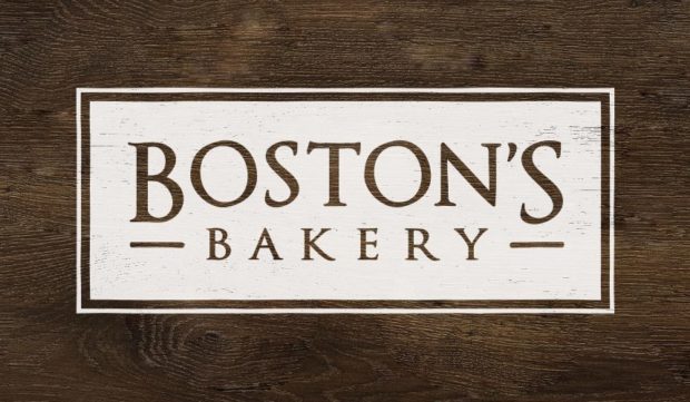
 The brand name ‘Boston’s’ brings a strong association with the distinct culture of the New England city, renowned for its association with the doughnut.
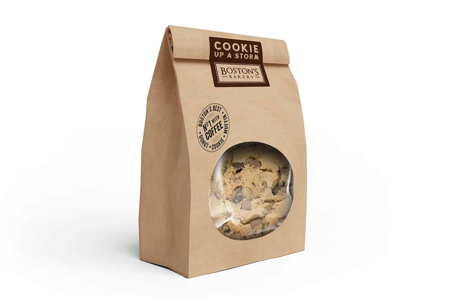
So from the ground up, we set the roots of our new brand look and feel firmly in an imaginary coffee shop in Boston, Massachusetts. Our takeaway packaging is kraft, and since in most environments the offer will accompany a branded coffee offer, bags are stamped with ‘No1 with Coffee’.
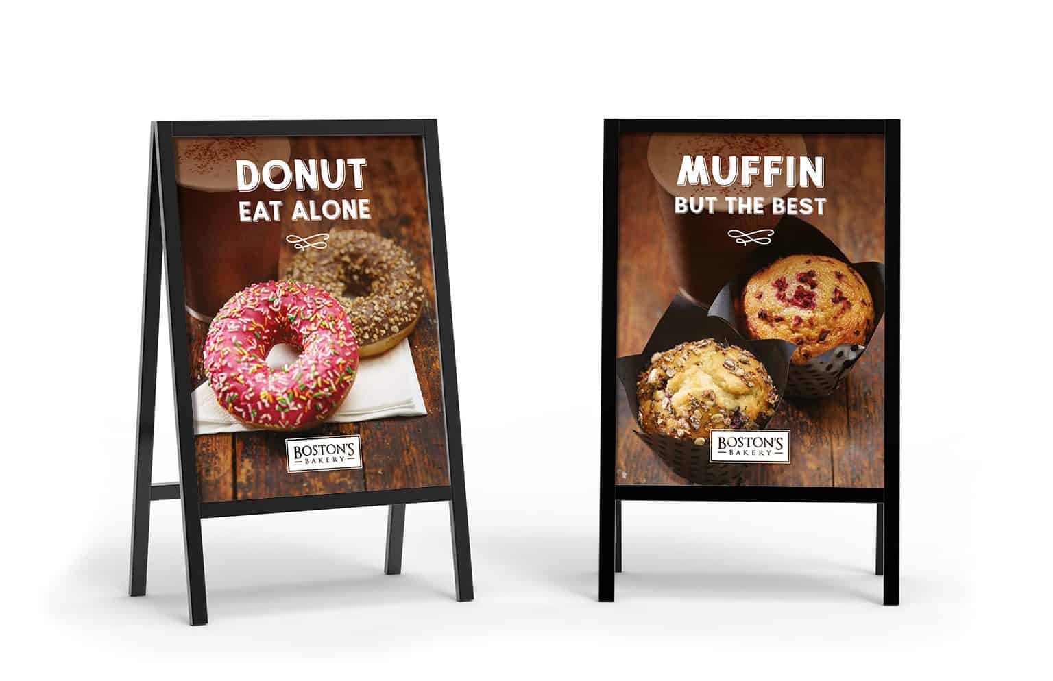
With a friendly, playful tone of voice, our point of sale communications are ‘muffin but the best!’ This is a donut shop after all, and donuts are some of the most fun you can have with coffee! All our messaging is relaxed and uncomplicated and leaves no doubt that Boston’s are passionate about their sweet offerings. At the same time as slipping in as many puns as possible.
We’re delighted with Boston’s new look. Especially how it manages to remain clear and grown up, while also channeling the fun nature of these sweet American treats.
Leave a Comment